
Painting
Painting your home (both inside and outside) doesn't have to be complicated! Here's how to pick the right paint color, choose the right paint finish, avoid annoying painting mistakes, learn how to paint your cabinets (or even paint an appliance like your fridge) and much more.

How To Paint Decorative Oars For Beach House Decor

Read This Before You Paint Your Brick House

A Front Porch Makeover At The Duplex!
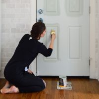
The Best Front Door Paint & Tips For Painting A Door

How To Paint Bathroom Floor Tile

Painting Our Brick House White!

How To Use The Best Paint Brush For Cutting In
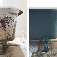
How To Refinish An Old Clawfoot Tub

How To Make Long Reclaimed Wood Shelves

How We Picked Our Pink House Color

Using The Same Beige Paint Color In Many Rooms
- « Previous Page
- 1
- 2
- 3
- 4
- …
- 15
- Next Page »