
Crafting & Art
Gorgeous and fun crafting and art projects you can whip up yourself - usually in just a few minutes. Learn how to hang a frame gallery, make painted baskets, sew a pillow or quilt, make a wreath, or build your own frames.

Neutral Living Room Makeover

2016 Rewind: Our Favorite Makeovers & Projects Of The Year
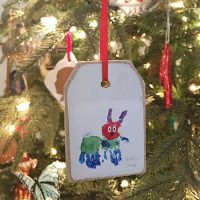
Making DIY Ornaments With Kid Art
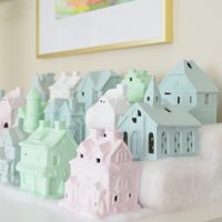
Making A Painted Christmas House Village
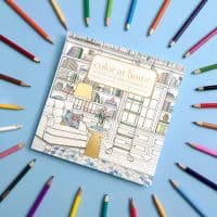
Behind The Scenes: Making A Coloring Book

How To Turn One Duvet Cover Into Two
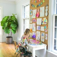
A DIY Cork Wall For Kid Art

Turning Race Medals Into Christmas Ornaments

Our Laundry Room Makeover

Hanging A Collection Of Frames All Over The Wall
How To Make Wall Decals
- « Previous Page
- 1
- 2
- 3
- 4
- …
- 17
- Next Page »