The office ceiling and walls are officially painted, which is good news because we’re at T-minus 48 hours until this baby’s scheduled delivery. Note: the trim is pure white in here (the same color as the desk in the middle of the room). No idea why it’s looking a little cream – maybe just the time of day/lighting?
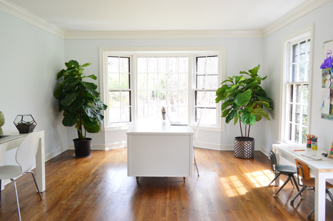
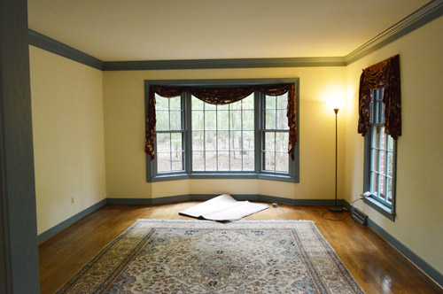
It’s still looking really stark in here (holy cow, who watched Game Of Thrones last night?), so we can’t wait to add:
- a rug
- window treatments
- a fun pendant or two over the desk area
- art
- more storage along the left wall (and a craft table/photography zone)
- an updated kid-desk area on the right
- etc, etc, etc
But even though we’re only around 10% done, it has come a long way since its former days of blue-trim.
And there’s nothing like some final-hour pre-baby hustling to get your blood pumping.
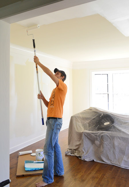
In the past we shared this video where I demonstrated a few cutting in tips that work for me…
… and there were a bunch of requests on this post for video footage of John rolling a ceiling and a wall, so our office-painting update was the perfect opportunity to catch him in action. This is by no means the professional way to paint a room, it’s just what works for us. So without further ado – here’s how John rolls:
*We mentioned a few brands by name, but none of them were paid/perked, they’re just what we like (we curated color collections with Benjamin Moore in 2012 & 2013, but didn’t have time to do one this year – and never used them exclusively, were paid to mention them, or accepted free paint while we did).
For those who can’t watch the video, here are a few highlights:
- John likes to use a rod extender to take the strain off his back while painting ceilings
- we don’t have textured ceilings so we use a roller that’s meant for “smooth surfaces” – usually by Purdy, Wooster, or Ben Moore (we’re not brand loyal, and usually just grab whatever’s on sale)
- if this room were carpeted we definitely would have covered the floor, and if you have issues with splattering or just prefer to keep yours under wraps it never hurts to use drop cloths (pros would for sure)
- watch the speed, amount of paint, and pressure you put on the roller – upping all of those things can be tempting to get things done faster, but keeping them all in check can contribute to more even coverage and fewer drips/splatters
- higher quality paint is usually thicker, so it tends to drips less (we don’t use ceiling paint on ceilings, we just use good quality flat paint)
- we skip the rod extender when rolling the walls, but otherwise it’s the same technique
- our preferred order is for me to cut in so John can roll right behind me, then I’ll do my second round of cutting-in and John will once again follow right behind with the roller (that way the roller can get as close to the moldings and eliminate any brushstrokes that I might leave while cutting in)
We’ve shared a few time lapse room-painting videos in the past, so we thought those might be helpful to include here too. Here’s one of us painting our old master bedroom in 2012. You’ll notice we used pretty much the same approach back then (I was less steady with cutting in along the ceiling, so sometimes we used tape up there).
And here’s another time lapse video of us priming the kitchen (along with the overhead beams) from 2011.
Now that we got the “how” out of the way – let’s switch gears to the “whys” of choosing our office wall color…
- We wanted something light and refreshing (we’re both drawn to airy and bright offices)
- The dining room on the other side of the foyer is going to be dark and moody, so we didn’t want another bold or dark room across from it
- I was campaigning hard for a soft honeydew green, but John worried it could hinder the function of the room (we plan to photograph smaller projects in here on a craft table, and he thought too much green would reflect in our shots)
- We had trouble agreeing on colors in here, so we grabbed four test pots (in Daiquiri Ice, Lime Froth, Palest Pistachio, and Tint of Mint)
Oh and one more tip is that when we applied those test paint pots (couldn’t get an accurate picture of them, but just picture four blobs on the wall in a few different places around the room) we painted them from top to bottom in alphabetical order, which helped us remember which swatch was which, so we didn’t mix them up. After a few days of debate we finally agreed on Palest Pistachio. It felt airy and light, wasn’t too green, and it didn’t hurt that it was named one of ten “Happiness Inducing Colors” by Remodelista. So here’s the room all done, in Palest Pistachio. It’s photographing a little bluer than it looks in real life – but it’s definitely a happy color that feels bright without being bold or neon.
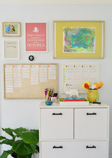
Don’t mind me, this is just my favorite picture ever.
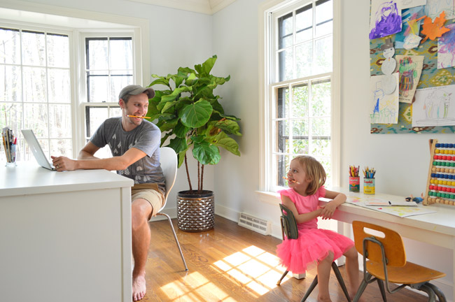
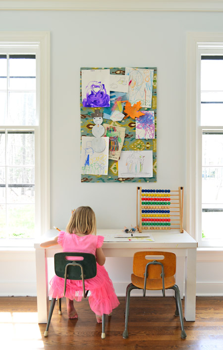
We have big plans to make a larger bulletin board above this kid-desk area, most likely from window to window, so that should be fun (the screens are open so the windows look crazy here – just pretend you don’t notice).
Feels good to have one more to-do list item checked off. You know, until a newborn comes along and the whole house goes to heck again…
Our Favorite Paint Colors
If you’re having trouble picking the right color to paint your room, check out these detailed deep-dive posts about our favorite paints:
- The 12 Best White Paint Colors
- Benjamin Moore Edgecomb Gray
- Benjamin Moore Simply White
- Sherwin-Williams Pure White
- Sherwin-Williams Extra White
Psst- Wanna know where we got something in our house? Just click on this button:


Leave a Reply