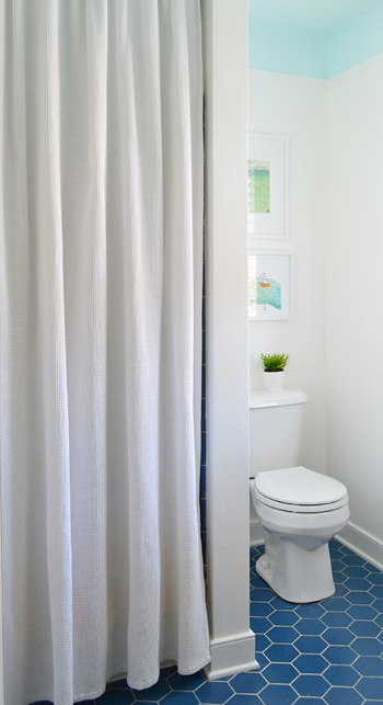
Happy Martin Luther King Jr. Day, guys. We’re back with a fully finished bathroom paint & trim project (we mentioned our plan here last week, and you saw a sneak half-done peek of it in the house tour video on Friday). So here’s what it’s looking like now:
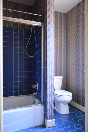
Which is a pretty stark contrast to what we started with. You might remember that we removed the glass shower doors pretty early on, but then we didn’t touch the room again until recently waging war on the wallpaper.
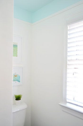
It’s a tough room to photograph due to all the doorways and nooks – especially when trying to get the ceiling and the floor in one shot. So forgive all of the super vertical crops and choppy shots. We hope they at least give you a sense of what the room looks like now.
As we mentioned in last week’s post, the thought behind the blue ceiling was to balance the floor. We’re actually charmed by the blue hex flooring, but we thought some up-high interest would be a nice counterpart. Heather’s bathroom (and this similarly blue-floored inspiration image) helped to guide our vision – especially the part about adding some simple architecture to create a transition between the colors.
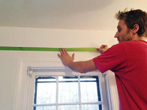
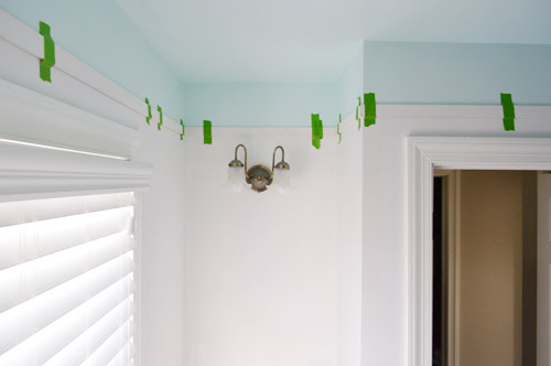
The first step was taping a horizontal border around the room where we wanted our blue color to start. We landed on about 8″ down from the ceiling, since it meant the border wouldn’t be interrupted by door or window trim but would still be substantial enough to look purposeful. I just held up my level and drew a pencil line along the wall… which then acted as my guide to apply painters tape. I wasn’t super meticulous at keeping my tape lines perfectly level since ultimately the paint edge would be hidden under the trim (so as long as it wasn’t majorly crooked, the trim would hide any small wavers or dips).
The next challenge was picking a paint color. We started off by doing some test swatches of colors we had on hand, like Nelson Blue (from our kitchen), Sylvan Mist (leftover from book projects), and Spirit In The Sky (a losing test pot from when we picked a front door color). Normally we’d go for subdued blues with a good amount of gray in them for the walls (like the two on the left) – kinda like a haint blue. But with the low bathroom lighting and the primary blue tiles on the floor, the grayed-out tones actually looked more gray than blue in here. Spirit In The Sky was exciting in a small swatch because it was bold and very obviously blue, but we worried that once it went around the whole room – and covered the entire ceiling – it would be too intense for us (paint tends to magnify itself from a small test swatch and looks a lot bolder when it’s all over the walls or ceiling). So you see how Sherry’s holding up another swatch?
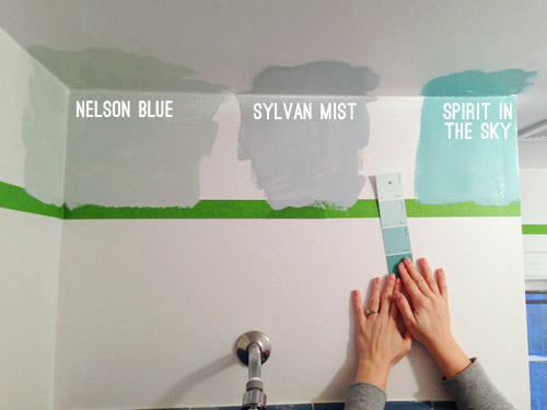
That’s Spring Mint (in an eggshell finish). Since nothing we had on hand was working, we decided to spring for a quart of a new color that was further from the blue-gray category, and more in the “pure blue” arena. Something like Spirit In The Sky, but a bit lighter and more subdued in intensity.
It took us two coats, but by that evening we had the blue border and ceiling that we were going for. As we peeled off the tape, we both wondered if we should leave it as is (i.e. forget adding molding). We decided it was definitely an option (especially if you’re someone who doesn’t have the time/money/tools to add it) but we wanted to take ours a step further. Mostly because we’re a little too in love with our nail-gun, and lattice strips are nice and inexpensive.
Speaking of lattice, we used the same pre-primed strips that we used for our last hallway’s board & batten. They’re super thin, light weight, and just 77¢ per foot from Home Depot. Sherry measured and cut the strips using our miter saw, and we taped them into place as she brought them up, just to keep track of how it looked and what walls were still incomplete. Despite all of the nooks and crannies in this bathroom, it took us under an hour to get everything cut and taped up… though it did involve about two dozen trips up and down the stairs between the two of us. Go quads!
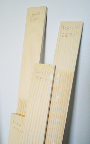
As we took them down to paint them, we labeled each one on the back so we knew exactly where they went when it was time to nail them into place. Many of the walls are similar in size, so we figured it would save us the frustration of putting the puzzle back together by trial-and-error.
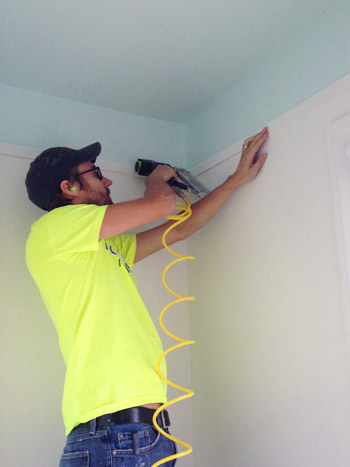
In addition to putting a coat of white (Simply White by Benjamin Moore) on the pre-primed slats, we also painted the walls the same color. Once that dried, we could finally attach the trim. This is one of those easier-with-two-people projects, so Sherry was with me holding things (the nail gun, the other end of the lattice strip, the level, etc) which made it go faster. We started with me nailing one end of our first strip with the nail gun (it was loaded with 1.25″ brad nails). Note the ear plugs, since in such a small space the sound of the gun was crazy loud.
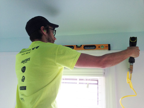
Then I held my level across it to make sure it was straight before handing the nail gun to Sherry so she could nail in the other end. This is a rigged photo since Sherry had to hop down to take this picture, but in real life it was a lot easier for her to hold the other end of the lattice up, and I’d check things with the level, say “good!”, and she’d fire a nail into her end. Then we could just continue around the room, making sure each piece lined up with the one before it.
Once we had all of the lattice hung, I went around the whole bottom edge with a bit of caulk, since our walls weren’t flat enough for them to looks seamless. I also used caulk to fill the tiny nail holes that we fired into the lattice on each end as we hung it. When the caulk dried, Sherry went over the trim with one more coat of paint – just on the front and under the bottom edge – to make sure it looked as crisp as the freshly painted wall.
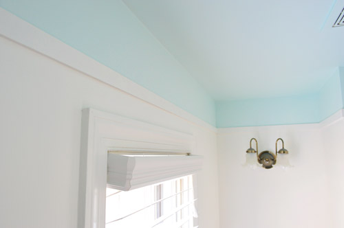
There are still lots of little tweaks that we’d like to do to this room for Phase 1 (see that light fixture above?) but so far we’re really happy with this slice of personality that we brought back into the space (you know, after ridding it of its wild wallpapered persona).
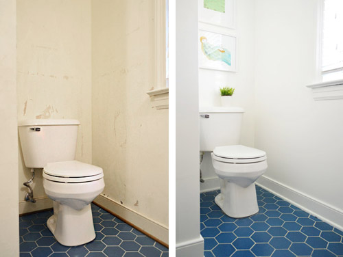
And I don’t want to ignore the power of the white paint in all of this too. Here’s the difference between our post-wallpaper-removal “gas station bathroom” look, and the post-paint after that we have going on now.
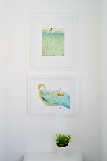
We also hung some art on the wall behind the toilet. These are prints we had from our last house (the top one is a page ripped from Real Simple magazine that hung in our guest bathroom, and the bottom one is a print by Sally at sadlyharmless.com that was given to us during one of our book tour stops last year and used to hang in our sunroom).
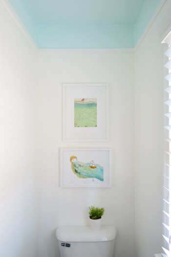
When we held them up together we initially worried they were a little too similar to be so close to each other, but decided just to work with what we have for now. The gradient of blues (the top print is a little lighter) actually seem to connect the lighter blue ceiling to the deeper blue floor in a nice subtle way.
At the end of the day, our entire bathroom update so far clocks in at a little over 50 bucks. Here’s the breakdown:
- Removing the glass shower doors (more on that here): $0
- Peeling the wallpaper (more on that here): $0
- Lattice trim from Home Depot: $25
- A quart of blue paint for the ceiling in “Spring Mint”: $30
- Shower curtain, white paint for the walls & trim, and art: $0 (we already had them)
- TOTAL: $55*
* If you don’t have a shower curtain, wall & trim paint, and art on hand, you might spend around $100 grabbing those.
We still have a few more inexpensive updates in mind for this room, but it’s already a lot nicer to walk into than the dark blue wallpapered space that we started with. What did you guys do this weekend? Any bathroom or trim projects in the works?
Psst- Last week we woke up to some surprise snow, and Clara really got into it.

Leave a Reply