After weeks of waiting for three dry days in a row to grout, Mother Nature is finally on our side and John’s finishing up the tile in the sunroom as I type this (while singing “grout, grout, let it all out”). He’ll give you the full tiling rundown tomorrow, and in the meantime, I’m more excited than Jessie Spano about this post (and she’s SO EXCITED).
As we mentioned on Facebook this weekend, thanks to your suggestions during our Blogiversary, we thought it would be fun to share some ideas for folks out there who are stuck with decorating dilemmas. We also knew you guys would have a ton of suggestions to add to the mix, so we hope these posts will turn into great group brainstorming sessions for any homeowners out there who are stumped. So let’s dive right in. Here’s Shannon’s issue:
Hey Sherry and John! We just moved into our house in July, and I am LOST. This photo is taken from our living room, which is very open. The area on the left is our front room, the brightly colored door goes to our garage, then there’s the funky bookshelf area (ARGH), our boring but wide stairway, and our downstairs half-bath.
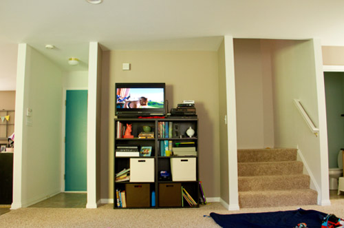
I LOVE color, NEED color, but need to keep it all cohesive down here (everything opens up to the same space). The thought of one color everywhere makes me want to cry! As you can see, I broke down one day and just painted the door to our garage to get some color, even if it’s temporary. I’m willing to buy paint cans tomorrow and show you afters! I just have no idea what colors to paint. Also, that horrible spot where the bookshelf and TV are currently living is too small for a couch, and nothing seems to make sense in that space. Our TV can go anywhere in the room (so it can move out of that nook). As long as I can keep Eugene, my coral-painted horse head, I’m happy!
We have three kids, so storage and function are always great things, but I also love some pretty, decorative things, too. My husband and father-in-law are my fabulous carpenters (they always seem to figure things out together that I throw at them), so again, I’m all about showing you the afters! Oh and don’t mind the blanket on the carpet–it’s rest time and my three littles are watching the Lorax. Love you guys! (In a non-creepy, even though we’ve never met kinda way!) – Shannon
**********************************
Guys, I stared at that picture for a while without having a clue, and then I realized that the nook between the stairs and the front door would be awesome with a big built-in to add tons of functional storage. Shannon would gain a spot to stash things out of sight (like kid-gear) from the six drawers down below, and she’d have a place to display her decorative stuff (like Eugene) up top. The best thing about adding something built-in right at the edge of that enclave is that the entire wall would have less of that nook-next-to-a-nook-next-to-another-nook feeling since it would break things up and bring that wall forward to create a great little focal point.
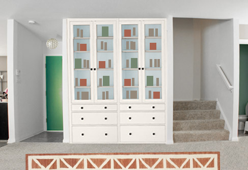
As for the execution of those built-ins, Shanon could either have her husband and father-in-law build them from scratch (since she mentioned they’re awesome carpenters in her letter) or she could buy something like these Hemnes ones from Ikea, which would hopefully be pretty simple to frame out for a nice built-in look. They’d also create a great place to add color. Maybe a soft blue tone on the back of the bookcase could be fun (like Valley Mist by Behr). Then the same bold door tone – except a little muddier with more gray in it so it’s not too intense – could end up on the walls of the bathroom to bring more color on that side of the space. Shannon could ask the person at the paint counter to add 15% more gray to the formula of the door color to hopefully end up with something in the right range.
I also photoshopped the walls a soft gray tone (like Silver Drop by Behr) and quickly switched out the light fixture by the door for this guy (I can’t help it, I’m obsessed with these – and the small one would be really cute there). Then I added this rug to the living area, just because that’s another easy way to add some color and interest, while picking up on some of the cheerful items displayed in the built-ins.
And just for fun, I made an alternate version with cooler periwinkle blues mixed with some warm corals and some deep navy tones:
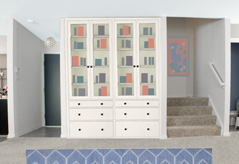
This time I used this rug and photoshopped an abstract painting on the wall going up those stairs to bring in even more coral and periwinkle to that wall, along with darkening the door and the bathroom to a rich navy tone (something close to Myth by Behr). I also made the ceiling a super soft blue tone (Lime Light by Behr) to layer in there with the light gray walls, and for the back of the built-ins, a sea glass green could be pretty too (Palm Breeze by Behr).
So there are two thoughts I had for Shannon’s space. Do you prefer the Option 1 (emerald and copper with hits of sky blue) or Option 2 (coral, periwinkle and navy with some sea glass green)? Or do you have a completely new idea to add to the pot? We’d love to hear what you guys would do, and I’m sure there will a ton of awesome ideas in the comments, so… fire away! And a big thanks to Shannon for sharing her problem area. We’re crossing our fingers for after photos to share with you guys!
Psst – Got a particularly tricky spot or a dilemma in a certain area of your house? Submit a photo (or two) along with a few sentences about what bugs you or has you stumped to [email protected].

Leave a Reply