Some of the same folks behind Richmond’s Homearama (who are working with us on our Habitat For Humanity Showhouse – which we’re planning to update you guys on ASAP) invited us to similar-but-new show called the Massey Street of Dreams. Like Homearama, it features custom built homes that are decked out inside by designers & decorators who collaborate with each builder and their team. But this show’s the brainchild of cancer survivor George Emerson, so it’s got a charitable slant in that all proceeds benefit our local VCU Massey Cancer Center. So just like we had fun sharing these eight homes with you guys, we’re psyched to share the four pretty places that make up the Massey Street of Dreams.
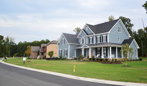
The homes are located side-by-side in a new community and (here’s the part where I’m jealous) they’re basically right across the street from water views of the James River. Each house is done by a different builder and a different design team, so they’re all pretty distinct. We love these types of tours because we always find ourselves saying “I liked the kitchen in that one the most” or “I’d take the bath from this one, but the patio from that one.”
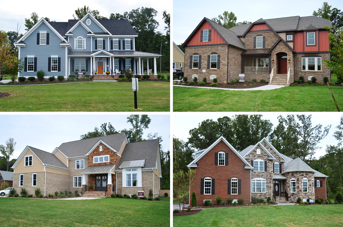
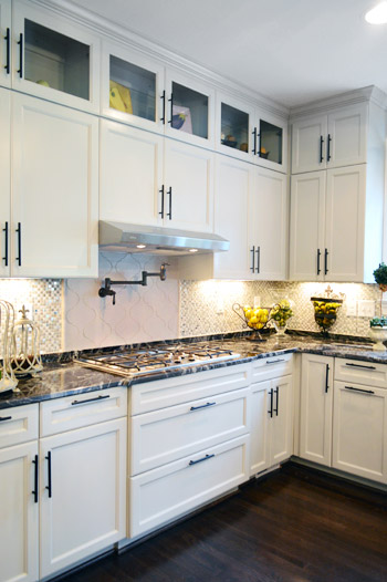
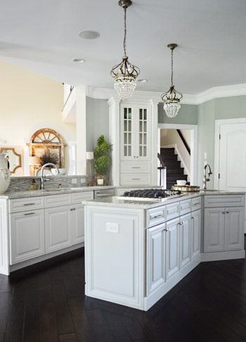
Let’s start with the blue one first. It was probably our favorite kitchen of the group, since it was hitting lots of the trends that we’ve fallen for like gray cabinets, an accent color on the island along with a different counter material, an exposed hood, etc.
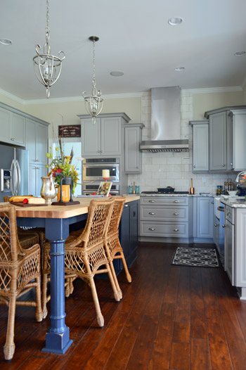
The marble subway tile backsplash was a nice classic choice too, and I don’t think we’ve ever met a glass-fronted cabinet that we didn’t like.
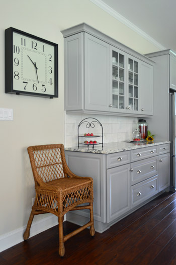
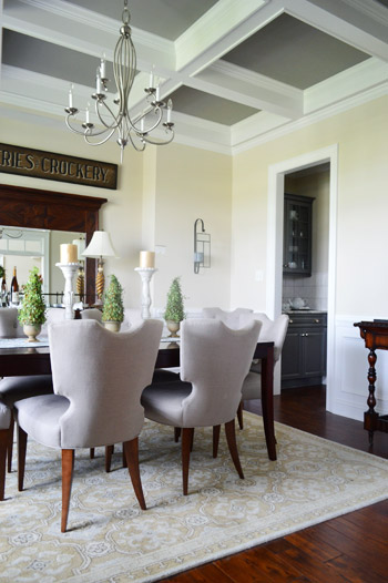
The butler’s pantry / dry bar area that connected the kitchen and dining room was a nice transition between the two spaces. The darker gray on these cabinets tied in with the color of the ceiling coffers (you can see that better in the next photo).
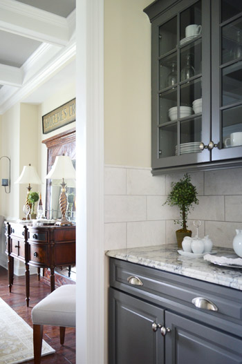
We love ourselves a coffered ceiling – especially since it lets this room get away with a dark ceiling color without making the room feel too heavy.
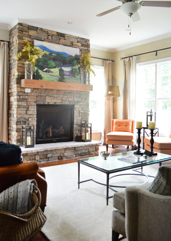
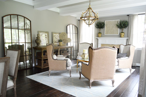
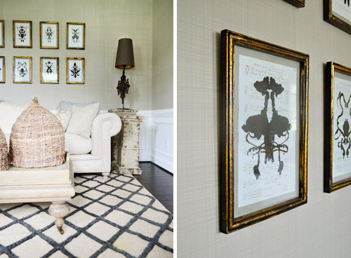
The living room was fairly traditional by most measures, but there were two patterned orange chairs in the corner that added an element of happy-casual. The stone + raw wood combo on the fireplace really cozied up the room.
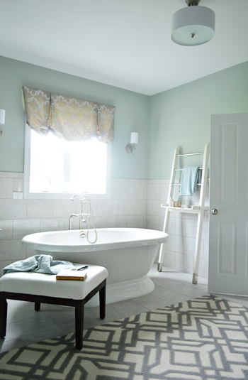
The house also had our favorite en-suite bathroom, namely because of the giant freestanding tub. This type of tub is similar to the one we’ve got slated for our showhouse project, so it was reassuring to see how awesome it could look in real life.
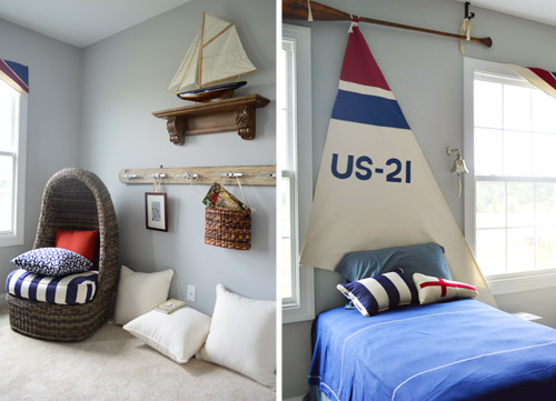
This nautical kids room was especially charming to Sherry, since she was (predictably) smitten with the egg chair. We both thought the details like the sail headboard (hung from an oar, no less) and the dock cleat hook rail were fun additions.
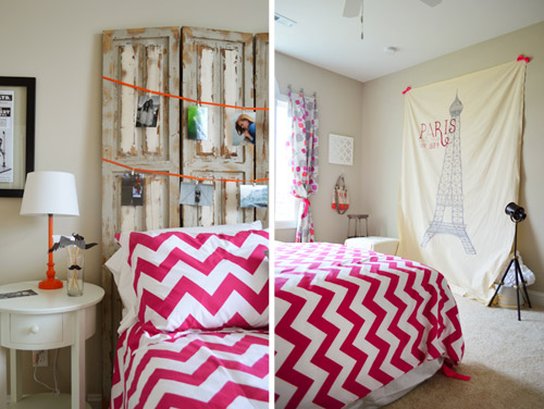
The teenage girl’s room was designed by – get this – an actual teenage girl. Apparently this high schooler is interested in going to school to be an interior designer so they let her get her feet wet in this space. It was a “Paris meets mustache” theme of sorts with fun details like actual photos of her and her friends, and this idea of a place for her friends to take silly photos against the big backdrop using props like the mustaches on a stick (in the bedside cup).
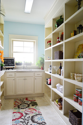
The second home had a more old world style to it, but the kitchen had one extremely modern feature. See that door to the left of the kitchen?
That’s a prep kitchen! According to the project coordinator of the show, they love sharing new trends in housing, and a prep kitchen is the next big thing. Essentially it’s an area where you can keep things like your toaster and your coffee maker out and plugged in all of the time, without cluttering up your kitchen counters. We’re not sure we’re fancy enough to require a prep kitchen, but if nothing else it’d serve as a nice pantry with a bonus sink.
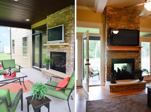
The house not only featured an open, covered porch with a planked ceiling (a kick you know we’re currently on ourselves) but it also had a DOUBLE-SIDED, INDOOR-OUTDOOR fireplace. How sweet is that? Oh, and let’s not overlook the outdoor TV.
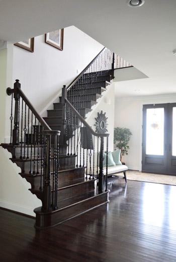
The third house I dubbed as the one occupied by “Richmond’s Kris Jenner.” I don’t know lots about the Kardashian matriarch, but I’ve picked up that she’s got a thing for high contrast black-and-white decor thanks to Sherry subjecting me to bits and pieces of the show. This house was the less in your face version of that, so I mean it as a compliment. It felt upscale, with a lot of white and gray along with some strategic punches of dark brown/black. For instance, we loved the visual oomph of this dark staircase.
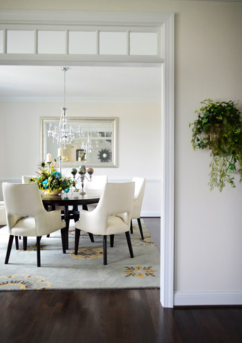
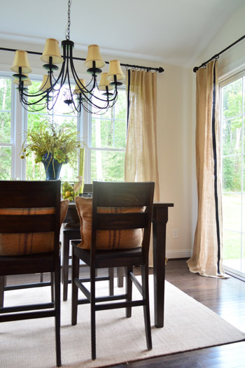
This dining room, like the one in the first house, featured a transom window in its doorway, which is always a nice added detail.
The kitchen in this home was definitely the most grand. I mean, look at all of those cabinets. And oh yeah, I couldn’t figure out how to turn that light off in the wine fridge. Oops. Just pretend ET’s in there, phoning home.
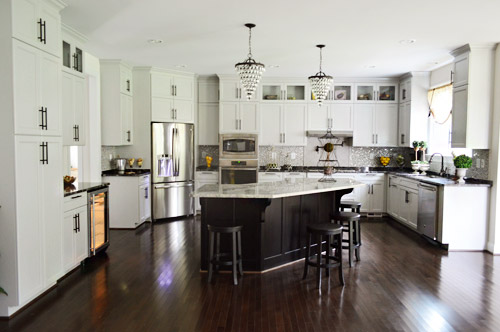
We loved the use of dark hardware to spice up the soft gray cabinets.
The breakfast nook off of the kitchen brought in some nice texture in the form of burlap curtains, which we learned was just some fabric that the designer added a black ribbon to with a glue gun. Sherry stood there smiling at them for a nice long time.
This last house was certainly the most decked out of the four – and probably the one with the most distinct style. It was packed with ornate, rustic pieces – sort like things you might find at Restoration Hardware. How great are those giant arched mirrors below?
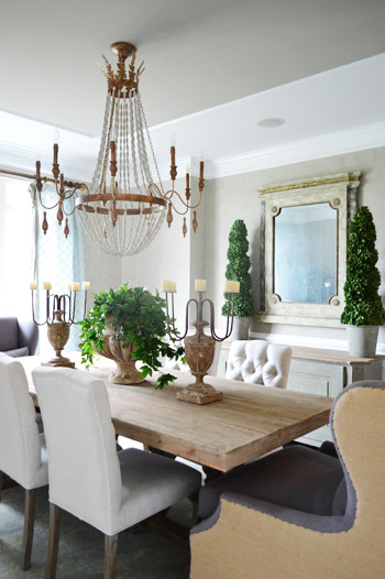
Here’s the dining room. Sherry always loves a beaded chandelier and I was digging the big cozy chairs at the head of the table… although I could see myself just falling asleep in one after a nice Thanksgiving meal and then dripping gravy drool all over the nice upholstery.
We were both fascinated by the kitchen because it was a layout we had never seen before. It was hard to capture on camera, but picture three identically shaped workspaces staggered apart but parallel to each other – one was a peninsula, one was an island and one was a wall full of cabinets and appliances like the fridge.
In the front sitting room there was this really interesting and well executed paint treatment that looked like grasscloth wallpaper. They even painted it in sections that mimicked where you might see the edge of one wallpaper roll meeting another.
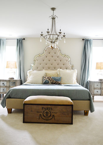
This house featured the new home trend of dual main bedrooms – one on the first floor and one on the second. Here’s the one upstairs (this picture doesn’t do the tufted headboard’s immense size any justice).
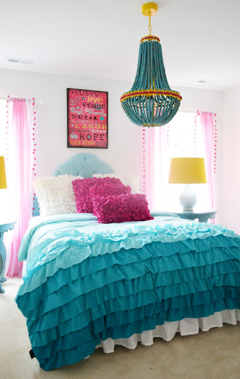
The girls bedroom strayed a bit from the rest of the home’s style (well, in color scheme at least). It seems to have been inspired by the chandelier, so we thought bringing in some of the yellow touches was nice, like those lamp shades on either side of the bed.
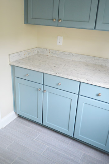
And last but not least, the mudroom in this home wasn’t styled yet but that didn’t stop us from ogling the mix of materials. The floor tile is what first got our attention, but it was pairing that with powder blue cabinets that made us excited to see how this space was coming together.
Obviously there’s a lot more to see in person, but this is a smattering of what caught our eye. These houses are open to the public Thursday through Sunday, this week and next (Sept 19-22 & 26-29) and all the info is on their website. It’s definitely a great cause!
Psst – Wanna see a finished showhouse that we designed? Click here for Our Full Showhouse Tour, which includes final pictures of every room, the floor plan, budget info, a video walk-through, and shoppable showhouse furniture & accessories.

Leave a Reply