We’re back from our week at the beach and excited to dive back into things! We were so lucky to have great weather and even got to squeeze in some window shopping and a thrift store trip, so that stuff’s in the hopper. Other than that we were beach bums and pool bums just soaking up the sun. Allow me to keep it real and mention that there were three kids under the age of four, so there were also meltdowns and even a cookie-tossing incident, but it was a great trip. We really loved Destin!

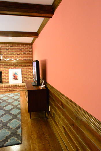
Back to the salmon living room walls that are no more.
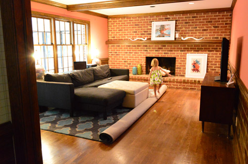
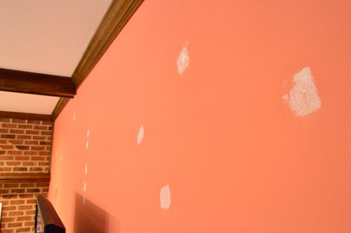
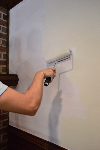
After rolling back the carpet and covering a few things with dropcloths to protect them from flying paint (doesn’t usually happen, but ya never know…) we ran around spackling all of the wall holes. Turns out there were a bunch. We just used Dap Crackshot and sanded it with a sanding block once it was dry and wiped/vacuumed up the dust before moving on to the priming step.
As is the usual for the painting duo that is John & Sherry, I cut in around all of the crown, trim, windows, and door frames while John rolled. In inside-out painting clothes of course. Here’s the primer coat going on:
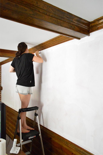
Since this is just a colored wall that we’re bringing back to a lighter and more neutral tone, we didn’t need anything heavy duty when it came to the primer (no stain-blocking or oil-based stuff was necessary since it’s not like dealing with potential wood-bleed). So we just used what we had leftover from priming some of the blue and mauve doors and trim upstairs.
In fact this entire project was a $0 update since we decided to go with the same paint color that we used in our foyer (Edgecomb Gray by BM, which is actually more of a creamy sand tone than a gray) since we still had enough leftover to complete the living room – but more on why we chose that in a minute.
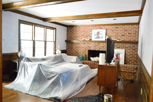
Thanks to the primer coat, we only needed one coat of paint. And since it was just the upper portion of the room that we were painting (along with the fact that there are a bunch of doors/windows/built-ins that cut into the “wall area” in here), we thankfully could rely only on our leftover paint.
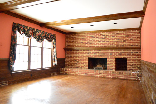
It’s definitely not a risky choice, but it’s such a breath of fresh air to see something pleasant and neutral after living with salmon walls for the last two months.
The coolest part is how much wider the room feels now that the color sort of recedes instead of saying “hiiiiiiii!” like the pink walls did.
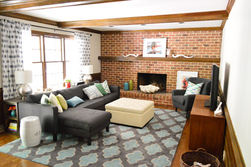
Here’s the other side of the room where we’d love to eventually create a nice wide doorway in the center that leads to the kitchen, with built-in cabinets on each side (sort of like the opening between the office and dining room in our last house). We’ll probably use an accent color on the back of the future built-ins, and since we plan to whitewash the brick on the other side of the room, there will be two nice “focal areas” going on (so we didn’t want the wall color to compete or make things too busy). We have even debated using a soft blue color on the ceiling between the white coffered beams. Should be fun to see where this room takes us!
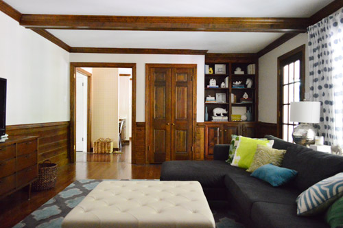
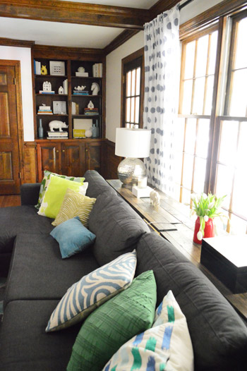
And since here’s a little sofa shot, I thought I’d toss out another update for you guys since we’re always being asked how we like our Karlstad from Ikea. Still love it! After a few years with a dog and a kid it’s still going strong. We can’t vouch for any other type of cover (ours is the dark sivik gray) but it’s super durable and washable. Check out our poor console table though – we still need to shorten it and make it interlock correctly since we just sort of mashed it together from the extra long version that we had at our previous house (back when our sectional was configured to be a lot larger). Hence that earthquake-lookin’ crack going on behind the sofa.
But back to the living room walls…
… we’re so happy we devoted an afternoon to de-salmoning them right before we hopped in the car for our road trip. It was totally worth the time and leftover paint to come home to such a lighter sight.
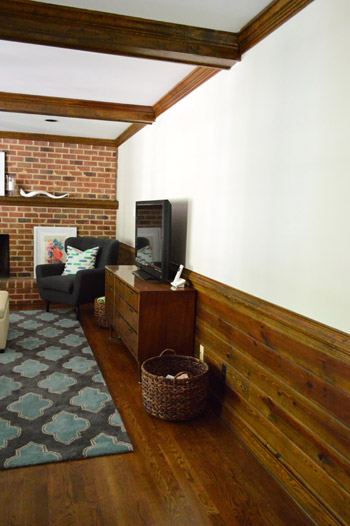
Perhaps the most upgraded view in the house is this one…
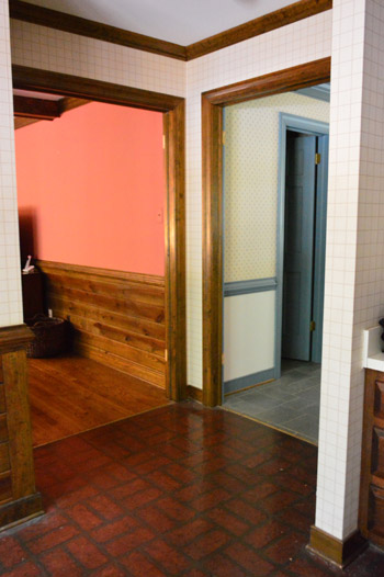
We still have a lot of wood trim to paint and three different floors going on, but at least there’s one less room full of wallpaper, no more blue trim, and the living room has been de-pinked.
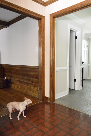
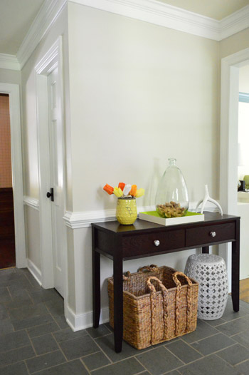
The funniest thing to us is how differently Edgecomb Gray can read when it’s next to wood trim vs. white trim. See how it looks darker in the foyer thanks to the contrast with the white trim? Meanwhile in the living room from this angle it almost looks off-white against the wood – so of course we’re more anxious than ever to keep on painting in there.
We have a devoted post all about this paint color if you want to see more photos of Edgecomb Gray in our house & read why we love it so much. You can also check out our round-up of experts’ favorite white paint colors.

Leave a Reply