First, let’s appreciate how fun My Little Ponies really were. I think I had around 6 as a child. And it was magical.
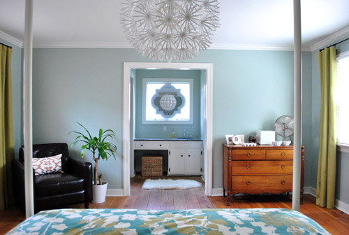
But in house-news-that’s-somewhat-related-to-the-throwback-mention-above, after what feels like months (ok, it actually has been months) we’re finally ready to fill the empty wall space on either side of the sink nook in our bedroom with something.
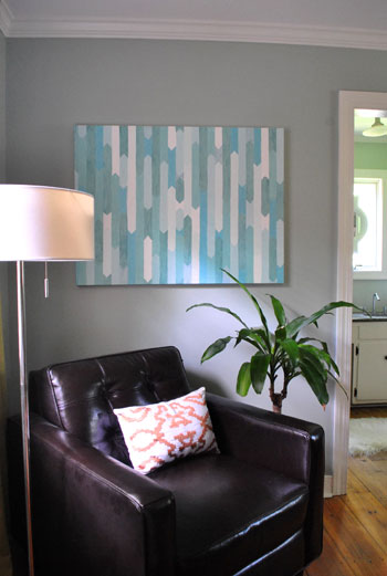
And since I had fun making a little Pinterst inspired painting (but then resolutely decided that I didn’t want it to live in the bedroom)…
It was time for John and I to have a few long chats about what we really wanted to fill the empty space across from the bed (no pressure, we’ll just wake up every morning and see whatever’s hanging there). The unanimous choice: bold and kind of moody photographs. Beautiful photos, but not too soft and pretty- something semi contrasty and interesting and sophisticated. Since our bedroom chandelier is kind of playful and our duvet is pretty bright and fun, we figured we needed some art to balance things out and point the room towards “grown up” (so it doesn’t begin to skew towards “playroom-esque” or “dorm-ish”). So we decided to troll around online to see where we’d end up.
The winning subject? Why horses of course. You all know that I have an uncommon love of almost every type of animal (usually of the white ceramic variety, but I like them all “in real life” too). And ever since I saw a few fancy glossy mag rooms with giant horse art I’ve been itching for some of my own. And this recent house crashing adventure (which includes some giant horse art in the nursery of all places) was the proverbial straw that broke the camel’s horse’s back. So I let my fingers do the walking to a few online art print sources (including etsy.com, 20×200.com, art.com, allposters.com, etc) and found everything from racehorses and black beauties relaxing on a farm to some wild gorgeous ponies in motion and even a charming serene horseback rider on a moody beckoning beach. And in case you can’t tell which of those descriptions I was most partial to, it was the last two (found here and here, both by the amazingly talented Jan Lakey).
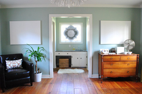
John definitely has a voice when it comes to art selection, so he felt strongly that the photos shouldn’t be “too energetic” and should be “a little calming and scenic” since it is our bedroom after all (you know, where we sleep). With this in mind, I figured the moody horse-on-the-beach shot would probably go over well, but I did worry that the blurry motion-happy horses might strike the hubby as too high energy. So I pulled out one of the tricks John laid out here (in an old post of yore about getting your hubby on board with a decorating decision that he might not be as thrilled about as you are) and figured the best way to sell him on my two favorite print picks would be to photoshop them into our room. That way he’d have a nice clear idea of what it would look like and I could hopefully soothe any worries that it’ll feel too chaotic or anything but sophisticated-and-a-little-moody-but-restful-and-serene-at-the-same-time. My quick little photoshop mock-up ended up looking a little something like this (ignore the “progress” label on the pic, I just used one from our House Tour page):
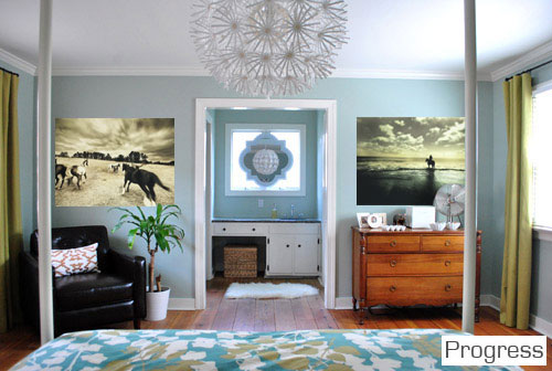
Of course that’s not how they’ll look fo’ real, but it made it a bit easier to picture how they might layer into the room. We both agreed that the room needed a nice slap of sophistication and contrast, so it wasn’t like we were looking for something pastel or blown out like a big cloudy sky or a gorgeous sandy beach. As I mentioned, we kind of thought the wacky Ikea fixture and the in-yo-face bedding needed something a little bold and contrasty and sort of chic (not that John would ever use that word). We also thought that something with some subtle gold undertones would relate to the curtains and the gold leaves in the bedding without looking downright matchy-matchy (like oil paintings or abstracts with that color might). And after I mocked everything up I was so so so sold.
Oh but you’re probably wondering what John thought. Just as I suspected, he loved the print on the right immediately. But then he did this pause thing when he looked at the one on the left which definitely freaked me out. But a second later he said “I like them.” Not one mention of the worry that the moving horses would feel too crazy or anything. And he said that he liked how the prints obviously weren’t a matched set but worked really nicely together. Just like that, he was so so so sold too. Oh sweet photoshop, how do I ever thank you for making things that could be five day heated arguments debates into two minute “I’m down” convos? Perhaps with this video of a dog saying I love you? This goes out to you photoshop:
Of course as far as art selection goes, it’s definitely one of those personal things. These horse prints surely won’t be everyone’s jam (and maybe not anyone else’s), but they’re ours and we can’t wait to get ’em. We’re having a lot more fun taking risks in this house. Even if it means doing things that might not have mass appeal – as long as something speaks strongly to us, we’re in. There’s actually freedom in letting go of the notion that your house should please everyone who walks in the door. It allows you be more true to yourself and your place starts to feel more special. Plus it means that your rooms won’t be in danger of looking like everyone else’s, which isn’t a bad thing either.
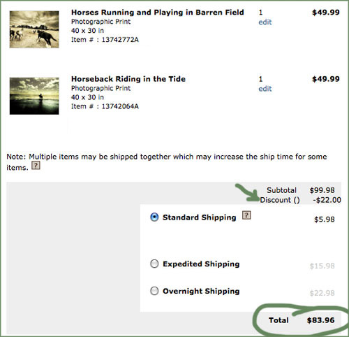
Now for the cost. Big a$$ prints (the ones that we ordered were over three feet wide at 40″ x 30″) can easily run you around $100+, but these two happened to be priced at a cool $49 a pop. And thanks to googling around for a coupon code to save me 22% off my entire order (it was “ZOLA” if you’re wondering, hope it still works), I scored both of them for a total of $77.98 (down from $100 for the pair) and paid just $5.98 for shipping, for a grand total of $83.96 spent. Which isn’t bad for over six feet of giant photography (printing our own photos that large with a local printer would probably cost us more).
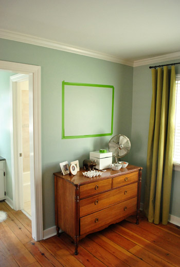
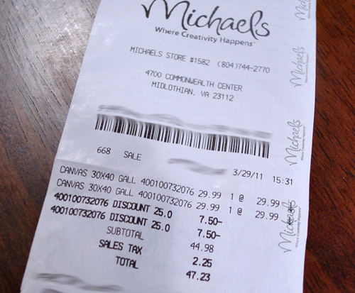
But giant frames are expensive, so how do we plan to avoid paying another 200 beans for two 40 x 30″ frames? By mounting the prints on 40 x 30″ canvases that I got a while back on super clearance from Michael’s with those two bedroom wall areas in mind (we even taped off the wall first to figure out what size tickled our fancy):
They were only $23 each after 50% off with another 25% off on top of that (we mentioned ’em at the end of this post a while back). In fact it was such a great deal that after we drove these two home I went back for a third for the entryway – which is the one that I painted here.
But back to the two I got for the bedroom – it means that we’ll have spent around $64 for each giant piece of photographic bedroom art when it’s all said and done (including the canvas and the art). Which isn’t bad when you consider that many printed canvases of that size sold by places like Ballard Designs or Pottery Barn are in the $200-300+ range (each).
After I spray mount (or somehow glue) each print onto one of our 40 x 30″ canvases, I might even cover them with matte Mod Podge for a more dimensional printed canvas look. Not sure how it’ll all go down yet – but you know I’ll share the details when I get there. Should be interesting. Hope I don’t blow it. Then I’m out $64 bucks a pop. Haha. More details when they arrive and are (hopefully) hung up nice and purty.
Psst- John and I watched the most incredible documentary last night called Catfish. We’re still talking about it. Definitely a must-see. It’ll make you wonder how well you know anyone online- including us. Hah.

Leave a Reply