Alternate title: Breaking Out John’s Painting Belt
It was like old times. For those who don’t get the painting belt reference, check this out for further explanation. Anyway, as we mentioned yesterday, we painted Clara’s nursery. And instead of cloning the exact space that she enjoyed in our old house, we took the move as an opportunity to switch up the wall color. We figure since we’re working with the same furniture and even the same light fixture and curtains (since I was too sentimental to leave them behind) we thought a new wall color would make things feel a little fresher- like the room is subtly evolving over time as opposed to being totally reinvented (since many of the major pieces are staying the same) or a carbon copy of the last room (just because we’ve been there and done that).
When we were chatting about what colors we could do, we debated a few options: some shade of blue (but we thought it would be too much with the blue bedding, changing pad cover, capiz chandelier, and the blue in the curtain fabric), some shade of green (too similar to the past version), some shade of yellow (not present in the curtains or any other items already in the room so probably too random), some neutral color (too safe for a kids room, we wanted to have some fun), some shade of pink (hmm, but is that super girly? we’re scared). And guess what we went with?!

Since there were soft tones of pink in the curtains as well as in our DIY mobiles (that we have yet to hang) we thought it would fit in nicely – as long as we kept things on the subtle side so it didn’t get too bright and overwhelming. But we didn’t just want a soft ballet pink (or a baby pink like the swatch in the photo above). We wanted something with gray/lavender undertones. It’s hard to explain, so we’ll let the swatch cards do the talking:
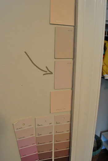
See how the one with the arrow towards it seems grayer and more lavender than the others? We thought it had a nice muddy sophistication and hoped that it wouldn’t look too pastel-ish and girly, since we’ve always loved that Clara’s room is full of greens and blues and other non-gender specific colors. Not to say that the room isn’t clearly a girl’s room now, but we just wanted the color to have a bit more dimension than just a soft pink. Plus you might remember this whole-house-color-scheme post, where the second swatch on the top row was a little bit pink, a little bit gray, and a little bit lavender. That was what we were going for.
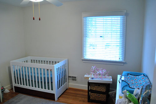
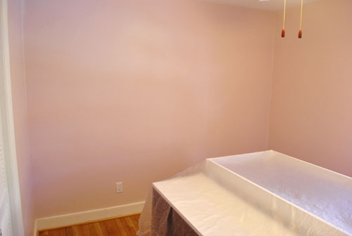
And in person it really does look dimensional and full of subtle gray and lavender undertones! The color is from Benjamin Moore’s Affinity line and it’s called Proposal (sweet, right?) but you know we’re too cheap to get BM paint for the most part, so we had it color matched to Olympic’s No-VOC paint at Lowe’s (which now not only has no-VOCs in the base paint, it also has no-VOCs in the colorants that they add, so it’s perfect for a nursery). Thankfully, we love how it turned out. It’s a hard color to capture in photos though (the subtleties and varied undertones aren’t always super apparent) but we did our best. Here’s the room before:
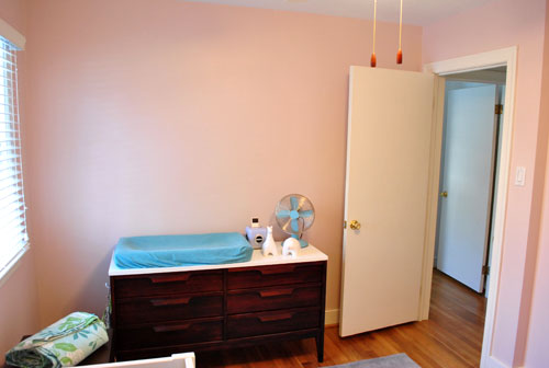
Here’s the room during painting (just so you can see our process, we pushed the big pieces into the center of the room and tossed a plastic tarp over them):
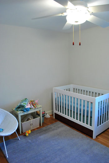
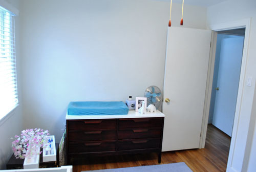
And here’s the room now:
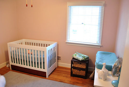
Of course it’ll look a lot more finished (and less pink-washed) when we hang the art, shelves, curtains, mobiles, etc. And when we switch out the ceiling fan for the blue capiz chandelier it’ll hopefully feel nice and complete for the beanette. And now for an obligatory look-how-cute-my-kid-is photo of Clara sleeping on her daddy. Is there anything sweeter?

But back to her freshly painted nursery. Her room was always the priority for us because we’d like her to feel settled and we want her room to always be a place where we can escape the chaos of the rest of the house (especially since most of it will be “in-progress” for a loooong time). So stay tuned for pics when we get our act together and hang everything up in there for a more finished look. Until then you can find us staring at about thirty swatches on the wall in the living room…

Leave a Reply