Inspiration really is everywhere, so when John and I were picking up a friend at the spa (we’re that fancy, we loiter in spas without actually getting massages) I couldn’t help but snap a few photos of some gorgeous packaging with some pretty amazing color schemes. Yeah I was that girl, taking pictures of the soap and candle display in the lobby. It was all in the name of decor though, so it was time well spent. Anyway, the point is that it’s so easy to find everyday objects that you love (like a favorite painting, a meaningful necklace – even a scented candle) and design an entire room- heck, an entire house- with that color palette in mind.
For example, take this pretty scented sachet and soap packaging that has gorgeous ethereal charm:
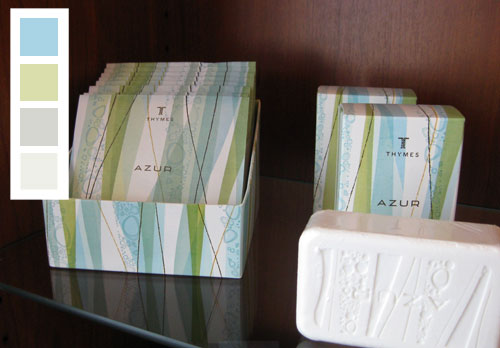
We love the idea of layering sea-glass-ish greens and blues with moody grays. So for anyone looking to recreate a whole house palette with this in mind, try painting a few rooms in Benjamin Moore’s Paradiso 717 (which is similar to the brightest blue square), a few in Benjamin Moore’s Sesame 381 (which is similar to the green square underneath), a few in Benjamin Moore’s Silver Sage 506 (which resembles the gray square underneath) and Benjamin Moore’s Springview Green 491 (which is close to the soft green square on the bottom). And of course instead of using this palette for your whole house you can easily adapt it for one room (picking one tone for the walls and grabbing bedding or upholstered furnishings and accessories in the other colors). And we should note that white definitely plays a big roll in this scheme, so breezy white curtains or even a white slipcovered sofa (or fluffy white bedding) would fit right in with this look.
Oh and remember that you can pick up each of those paint chips (for free) at your local Benjamin Moore store and have them color matched at Lowe’s or Home Depot to save money by buying Behr, Valspar, Olympic, or Glidden paint instead of Ben Moore (all the lower cost brands that we named are ones that we personally love and have used in our own home after having them color matched).
Next we have this playful and punchy palette that we think would look charming in any modern home full of crisp white tones and sophisticated inky blue accents (just like the bottom square in our color palette- which was inspired by those blue candle boxes):
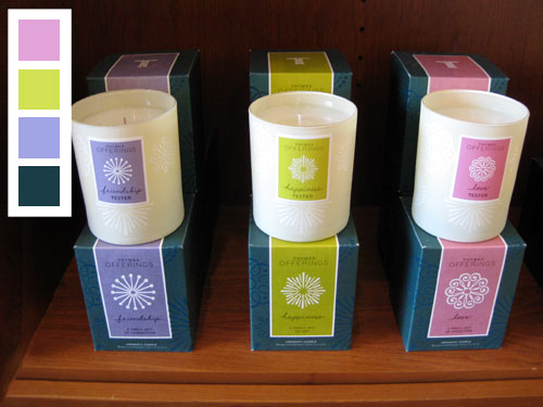
Sure the pink, lime and purple hues are fun- so they’d definitely work in a nursery or a playroom- but we can also picture this scheme in a chic family room with stark white walls and a clean-lined dark peacock blue sofa with breezy curtains in the same hue. Then the purple, lime and pink tones could be brought in sparingly with bold accents, like a large lime vase on the center of a white lacquered coffee table, and two pink ceramic based gourd lamps that could be placed on either side of the sofa (which might be accented with lime and purple pillows). Oh and if you’re looking for similar paint tones to those pictured above, try Benjamin Moore’s Blue Viola 1424 for the purple color, Benjamin Moore’s Artichoke Hearts 382 for the lime tone and Benjamin Moore’s Angelina 1376 for the pink hue.
Next we have a simple three color palette (again with a lot of white worked in, so be sure to include that to mimic this effect) along with a dark evergreen tone, a softer lime color and a pretty pop of blue (see how subtle the hints of blue are in the packaging?).
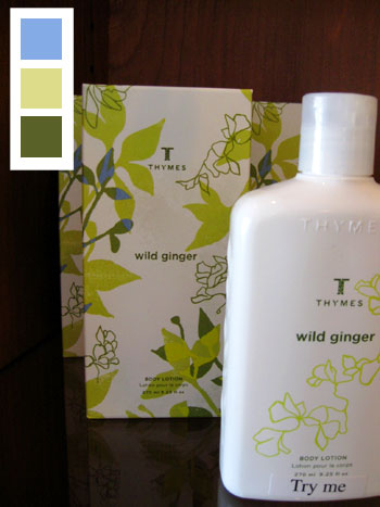
To get this look, try Benjamin Moore’s Northern Air 1676 for the blue, Benjamin Moore’s Sesame 381 for the soft lime tone and Benjamin Moore’s Oak Grove 489 for the deep green tone. And here’s a tip on that blue color. It’s probably best used for accessories and even painted furniture pieces since it could be a bit much on the walls (we like our blues to be slightly muddier on the walls so they don’t look like a little boy’s bedroom). Unless off course you’re planning to use this scheme in your little boy’s room, in which case we say, by all means, use it on the wall.
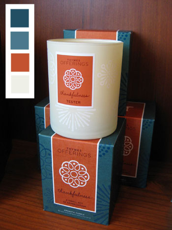
Our next palette is a nice demonstration that three colors (two of which are similar to each other) don’t have to be boring.
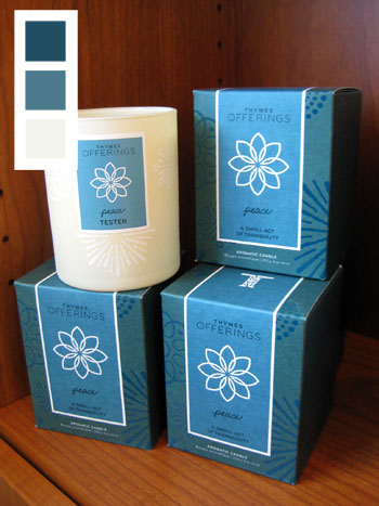
A room with cream walls (like Benjamin Moore’s Winter Wheat 232) and dark inky blue accessories in two different tones (like Benjamin Moore’s Lakeside Cabin 1658 and Spellbound 1659) would feel high contrast and elegant- not flat and boring even though there really are only blues and creams being layered in the space. Of course texture would also be key here (see all those tone on tone designs on the candle boxes?) so printed pillows and a nubby textured rug would really tie a room with this color scheme together for a high end effect with interest to spare.
Next we have a more feminine palette with deep plumb, medium pink, metallic-y gold, and whisper soft pink:
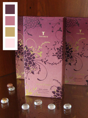
The light and subtle pink would make a great wall color (try Benjamin Moore’s Wild Aster 1240) while bedding, upholstery, accessories, and even a stunning painted furnishing or two could make up the rest of the palette. For the metallic gold, try bringing in actual hammered gold accents like a gold-toned tray on the coffee table or a sleek brass lamp on each side of the bed. Meanwhile the deeper pink (try Benjamin Moore’s Victoriana 1263) and plum tones (try Benjamin Moore’s Ruby Dusk 1267) can be used for other accessories like pillows, throws, vases and art. Extra credit: painting a large dresser or table in that luxe plum color would definitely make for a stunning feature in the space.
Then there’s this modern yet classic color scheme which includes cream, persimmon, and two tones of that same inky blue that we’ve seen a few times already. We love how crisp and saturated this palette feels, although it’s still not too overwhelming thanks to that cream which tempers the other more high-contrast colors.
We could actually picture this scheme in a dark home office or moody den with the lighter of the two inky blue tones on the wall (try Benjamin Moore’s Lakeside Cabin 1658) and a slew of accessories and accents in cream (try Benjamin Moore’s Winter Wheat 232), dark blue (like Benjamin Moore’s Spellbound 1659), and persimmon (try Benjamin Moore’s Pilgrimage Foliage 2175-20). Oh and handsome dark wood furnishings would fit right in (along with some cream upholstery which is derived right from the palette).
And lastly we have a super soft and serene scheme with beachy blues and greens and a dash of sweet pink.
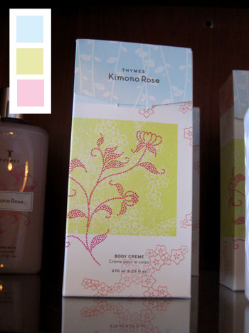
Again there’s a fair amount of white in this packaging, so bringing in white bedding or upholstery along with crisp white curtains will really help the soft and subtle green, blues and pinks pop. And when it comes to hunting down similar colors to those shown in the palette above, try Benjamin Moore’s Paris Romance 1262 for the pink, Benjamin Moore’s Sesame 381 for the soft lime, and Benjamin Moore’s Blue Haze 1667 for the blue.
Oh and just in case you’re wondering how offering up these paint chip colors will help you design an entire room when you can only pick one paint color for the walls, grabbing all the swatches will come in handy because you can bring them with you when you shop for accessories- so selecting lamps, art, pillows, bedding, even an upholstered chair will be even more foolproof thanks to your pocket sized color guide that you can hold up against any item to see if it’ll work.
And so ends our trip to the spa where we left without any hands-on treatment but lots of home decor inspiration. Have you guys ever gone somewhere or seen something that has nothing to do with paint chips or home decor and thought “I could totally decorate an entire room around this”? Do you and your partner have a favorite accessory or piece of art that you can use to settle a pending decorating dispute (hint: if you both love it, use those colors in your home since you can both agree on them!).

Leave a Reply