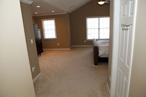
When Phuong and her husband Jeff sent over their Design Dilemma after pictures we couldn’t wait to share the goods. We know that many of you are chomping at the bit to see how our mood boards turn out (believe me, we are too) so we’re always thrilled to see how those spaces transform after each homeowner gets down to business. You may remember that we whipped up this custom mood board for Phuong and Jeff a while back when they came to us for help turning their bare and basic bedroom into an inviting and cozy place to unwind after a long day. Here are the before pictures to refresh your memory:
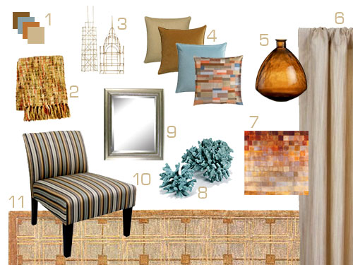
And here’s the mood board that we created to add a splash of color and some crisp and modern layered interest for ambiance to spare (see more mood board details here).
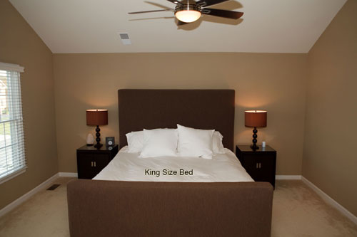
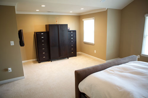
And now for Phuong and Jeff’s after pics. Here’s their newly spruced bedroom thanks to some colorful and textural accessories (which really amp up the formerly brown on beige space):
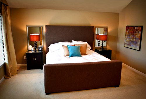
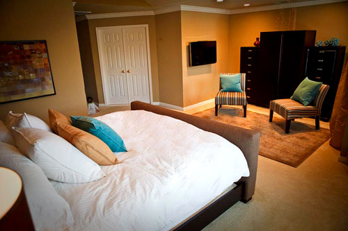

Didn’t they do a fantastic job in there? The room is so much cozier and more inviting thanks to everything from those fun striped slipper chairs to the large abstract art print that they hung across from the window. We love the pops of aqua and amber along with the added texture and interest that things like the area rug and the curtains introduce to the room- and even the smaller upgrades like the blue faux coral on the tall chest across from the bed (or those pretty mirrors placed behind each night table to bounce around more light) make the entire space feel polished and special. And here’s what Phuong and Jeff had to say about their big bedroom makeover:
What can we say? We LOVE it! We ordered nearly every single item that you recommended and everything came together very easily (sorry it took us so long to send the after photos to you). The room looks great and we are very happy! Thanks so much for the awesome mood board… we’ll be back again for more help! -Phuong & Jeff
No thank YOU Phuong and Jeff, for sending us your room update (we get positively giddy whenever they turn up in our inbox). Didn’t they do an amazing job bringing that mood board to life? It looks so warm and yet so modern at the same time- and we love that the mix of their gorgeous high-end existing furniture blends right in with affordable slipper chairs and curtains that we hunted down from Target along with the on-sale decorative accents and pillows (in the $20 range!) that we found at places like ZGallerie, Crate & Barrel and CB2. So let’s all shower Phuong and Jeff with praise for being so wonderful and sending us their pretty after pics. And here’s hoping more Design Dilemma after photos will be landing in our inbox very soon…
Update: We sadly can no longer find the time to take on client commissioned mood boards (and just whip up general inspiration boards instead) but if we ever reinstate them we’ll make a big announcement!

Danielle@Newlyweds Paradise says
OOOO! Very nice! Love the two chairs together and the blue coral!
Melly says
Wonderful job Phuong and Jeff! Thank you for sending your after pics for all of us to admire.
marianne says
Beautiful! So inviting! thank you so much for the “after pics”.
The Virginia House says
Great new look! They did a great job with your suggestions!
ashley @ Mutschler Family, Dallas Edition says
I love all of the rich colors! You guys did such a great job!!
Cecelia says
Your bedroom looks like a jewel box, Phuong and Jeff.
Warm and enveloping, yet elegant and serene.
I especially LOVE LOVE the wire building sculptures atop the armoire.
The only thing that I might do differently is to let those sculptures stand alone (did I say that I LOVE them…), and put the amber bottle and the coral on the nightstands.
Enjoy your bedroom, folks! It’s sophisticated and gorgeous!
Holly says
Very “comfortable & cozy” looking. Love the chairs and accents. Great job you guys!!
{The Classy Woman} says
Looks great! I love the idea of putting mirrors behind the lamps mounted on the wall-pure genius! I saw some of that blue coral at ZGallerie and fell in love!
Begoña says
Love the turquoise thing, and those chairs!!!my oh my!
Jessica @ How Sweet says
Another warm and gorgeous room. Stunning!
Nichole says
I love seeing the completed project! It looks amazing.
nue says
it goes without saying that we all LOVE these after pics. looks like an easy low budget redo that looks wonderful! can’t get over the simplicity of it all! good job phuong and jeff! and awesome moodboard sherry and john! teamwork ftw.
Tricia Rose says
Sometimes when I see Before & Afters I prefer the Before, but this is classy and cheerful and not over-the-top, or change for change’s sake. And it still looks like their room: congratulations!
Cheryl says
This is amazing. The mirrors behind the lamps is pure genius — I’m always worried about adding mirrors to bedrooms, the whole feng shui thing! But this is soothing and adds so much sparkle to the room. You did a great job of transformation!
Erin says
Wow, the room looks so great – I love all the colors!! I actually just bought that same “warmth” picture. I got it from Kirkland’s in Tennessee. All framed up with nice thick frame it was $149.99. I thought it was a pretty good deal. It compliments everything in our room. Don’t know where all they are, but it seems like we have a far amount in the south?
Mandy Ford says
Gorgeous! Love those colors – turquoise is one of my favorites right now.
Megan H says
It’s beautiful! Thanks again for showing your off your brand new bedroom!
Leslie @ DIY Diaries says
Love the mirrors behind the nightstands – never would have thought of that and it adds so much dimension to that wall!
Great job all.
Cheryl says
The accents work so well. Those CB2 finds (Chicago and New York Buildings, made in bamboo, my two favorite cities) called out to me and I did not resist. Just placed an order as they are on sale! woo hoo!
Dana @ House*Tweaking says
OH, so cozy! The mirrors behind the lamps are by far my favorite element…what a way to make the bed a focal point!!!
Focipresley (Bon) says
The room looks lovely indeed. I think the room would benefit additionally with a bench(es) at the end of the bed.
CarMaj says
this room looks amazing! great job!!
julia says
Beautiful! I love the mirrors and the curtains and rug add a lot of warmth and sophistication! My two suggestions would be to add some artwork over the headboard (I picture 3 matching dark wood frames in a row) and to add a small round coffe table or ottoman in front of the chairs (for a place to put up your feet or place a cup of coffee). Also, if you ever want a change, I think the room would look awesome with a soft and light gray/blue tone on the walls. That color would look awesome with the dark chocolate furniture and pops of turquoise! All in all – it looks amazing as it is!
Misty says
This looks fab! I especially love the bambino on the floor to the left one of the pics! cute!
ShannonF says
Love this! One of my favorites :)
Pammie Lou says
Stunning! Your ideas were followed to a “t” and the outcome was fabulous!
Katrina says
Looks so much more inviting – what a large bedroom you have! The curtains really warmed up the enture room, great job
Keeley says
It’s perfect. It’s my favorite “after” from one of your mood boards. I especially love that they kept the paint color on the walls and I LOVE the mirrors behind the nightstands.
eli says
Wow… The difference is unbelievable!
Kelly says
love the colors and the art, very cozy! thanks for the after pics, made me happy!!
Lisa in Seattle says
Oh, I’m so glad Phuong sent in these afters! This was one of my favorite mood boards and it looks gorgeous. I’ll bet pictures don’t do it justice. Love the curtains, that artwork, and the lampshades. I can only imagine how nice it would look in candlelight.
Christine says
Congrats! You took a “nice” room and made it beautiful.
Dan says
Very cool!
patti says
looks beautiful – love the color pallet.
Laurendy says
The room turned out beautifully! It’s always awesome to see your mood boards come to life.
Marie says
I cannot believe the change! I adore the accent colors and patterns of the pillows/chairs. How does it feel to get to go home to a gorgeous hotel room every day?
Ericka says
I LOVE the colors! Beautiful! I would also suggest adding something above the headboard and also I think adding a pillow with all the colors (I see a pillow like that in the mood board) and placing on the bed – perhaps taking out one of the tan pillows. Also, the white bed cover looks a little stark with everything else. But, all in all, it looks awesome!
Shelley @ Green Eggs & Hamlet says
Kudos to Phuong and Jeff – I love seeing the mood board after pics. I think my favorite part is the side table lamps with mirrors behind.
Noelle says
WOW! This looks fantastic! I love that painting, the colors are so vibrant!!
On another note: I’m actually really embarrassed to admit this but the other day I had a dream about you two!! ((blushing!)) Okay, so you two were in your car and for whatever reason, I either met up with you guys or bumped into you. Anyhow, I had these samples of granite in my hand and I was so confused on which to get. So I remember whipping them out of my bag and handing them to you Sherry and you picked out the color you thought was best! John (in the driver’s seat) just kept looking over at me like I was some mad woman who just bum-rushed his wife lol. I actually woke up laughing because the dream was so odd! I don’t even know you!! (Well, I feel like I do in this virtual world) :) The funniest thing of all is I must have subconsciously missed reading your blog because I had been ill and took 2 days off of work (which is where I religiously keep up with your site). Too funny huh?!
YoungHouseLove says
That’s pretty funny! I love that John was the one who gave you the odd look because we’ve heard from at least two other readers who have said that John was realy nice in their dream and I was snobby or weird. Funny, right?
xo,
s
Karen says
So, are area rugs on top of wall to wall carpeting acceptable? Does the carpet have to be a low pile for that to work properly?
YoungHouseLove says
Yes! We love rugs over wall to wall carpet. Any seating area that floats in a space (which is often how they look best) needs something to ground and define just that area- so a rug over a carpet (be it jute, wool, or anything really!) often looks fantastic. As long as the wall to wall carpet isn’t anything thick and shaggy it’ll be great. Go for it!
xo,
s
Nikki P says
It’s amazing how the mirrors totally enhanced the bedside lamps. I am soooo doing this in my bedroom! Great idea!
Pam Cook says
Spectacular! The accessories really made this room. Love, love the colors!
laura says
wow, that is gorgeous and exactly what I wish my bedroom looked like! I don’t have as much space, I believe, as this room, but the colors are perfect. Unfortunately, my bedroom walls are white and I cannot paint them ’cause I rent. At least I think that’s the deal. Ah well. Lovely room and design!
Laura in LA says
The room looks great! I wish my bedroom was this spacious…so jealous.
Karen says
I will definitely give the area rug over wall to wall carpeting a go. My husband had told me that it wouldn’t work, but I really think it is worth a shot now. Thank you for the encouragement!
malibou says
Absolutely lovely. The color palette intriqued me, so it is fun to see the after. Brilliant.
Ainhoa Vega says
The mirror behind a lamp idea is brilliant, I love the look! I think I’m going to do this in my entryway with candles instead — I love turning them on, it feels so cozy in winter.
Jan says
This room is gorgeous! Your mood board suggestions were brilliant yet again…love the mirrors behind the night stands, the wire sculptures, the colors, accent pieces…well, loved it all! That armoire piece on the far wall across from the bed is amazing. Is there any way to find out where Phuong and Jeff purchased it? Thanks Sherry and John…you guys are a true inspiration!
YoungHouseLove says
Hey Jan,
Good question! That answer might be in the comment section of the original post with the mood board (which we linked to above). Hope it helps!
xo,
s
Heidi H. says
Very crisp! Lovely job!
alli says
Quick question about handles! We bought a great bedroom set on CraigsList but I’d like to update the handles. After going to many, many home improvement stores I can’t find a handle that fits the current handle holes. Thoughts on where I can find/order odd sized handles? If I can use a handle that covers (read: 100% hides) the current hole do you recommend drilling new holes?
YoungHouseLove says
Yup, we would suggest finding larger handles to obscure those holes. It’s a great way to reinvent a piece of furniture when you can’t find odd sized hardware. Hope it helps!
xo,
s