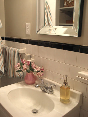
We snagged two soap dispensers that are as eco-friendly as they are easy on the eyes. Check out how recycled glass and Restoration Hardware-esque looks (on a Target budget) can sleek up your bathroom in a snap.
[ Read More ]
Home Decorating & DIY Tutorials
We snagged two soap dispensers that are as eco-friendly as they are easy on the eyes. Check out how recycled glass and Restoration Hardware-esque looks (on a Target budget) can sleek up your bathroom in a snap.
Our first feature in Do It Yourself Magazine is finally here! [Insert happy dance here.] Here’s what you need to know to check it out for yourself.
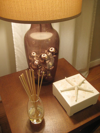
We whipped up another cheap and easy DIY project… and this time it’s a make-your-own reed diffuser to freshen and swankify any room. Best of all, it comes in under $5 and takes about five minutes to make.
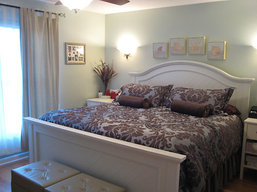
We’re dropping in on a cute couple’s townhouse to show you eons of space saving tips and tricks. Come on in!
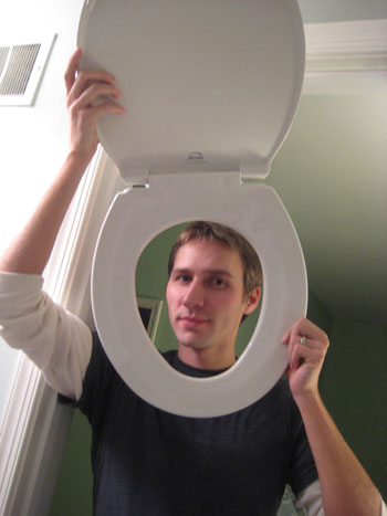
Maybe you have an old green toilet like we inherited with our home. Maybe you’re upgrading to a low flow throne. Maybe you’re going for a taller “comfort fit” version. No matter the reason, we’re here to help you switch out your toilet with ease.
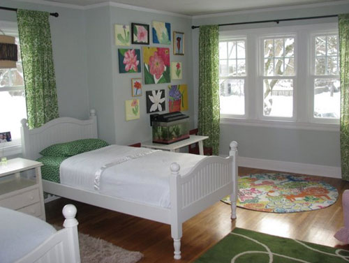
Our latest reader submitted room makeover is bright and happy- just as a kids room should be. Check out what some paint and a few accessories can do to a space. It’s almost unbelievable- and oh so affordable!
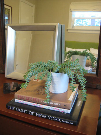
We snapped a few shots of the house plants that abound at Casa Petersik. See which plants (and planters) float our boat, and tell us which ones float yours!
“Can you help me save money on my bill?”… that’s what we asked three utility companies recently. And lowered our annual bills by almost $600. Crazy, eh?
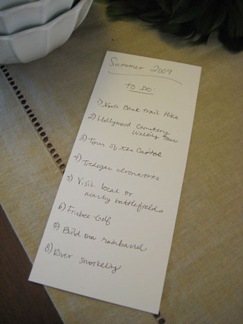
We’re compulsive to-do list people, so when it comes to recreational activities, we figured they deserved a list too. Check out our weird little list tradition… who knows, you just might decide to do it too.
Want some fresh, framed fern art for your home? Enter our latest giveaway for this beautiful piece from Art.com. We’re taking entries until Wed, Jan 14th at 8pm.
The latest issue of R. Home magazine is out, which means another one of our columns is circulating. The thrill! This issue we offered up a bunch of cheap make-your-own art ideas. Happy hanging…
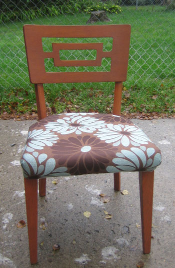
We couldn’t wait to share these stunning chair makeovers that Stephenie sent our way. It’s amazing what some new fabric can do!